You're probably familiar with the iconic logos of tech giants like Apple, Google, and Facebook. But have you ever stopped to think about the humble technology icon that powers your everyday interactions with digital products? From the simple yet intuitive icons on your smartphone to the intricate graphics that represent complex software applications, technology icons play a vital role in shaping our digital experiences. In this article, you'll learn the ins and outs of technology icons, including their importance, design principles, and best practices for implementation.
What are Technology Icons and Why Matter?
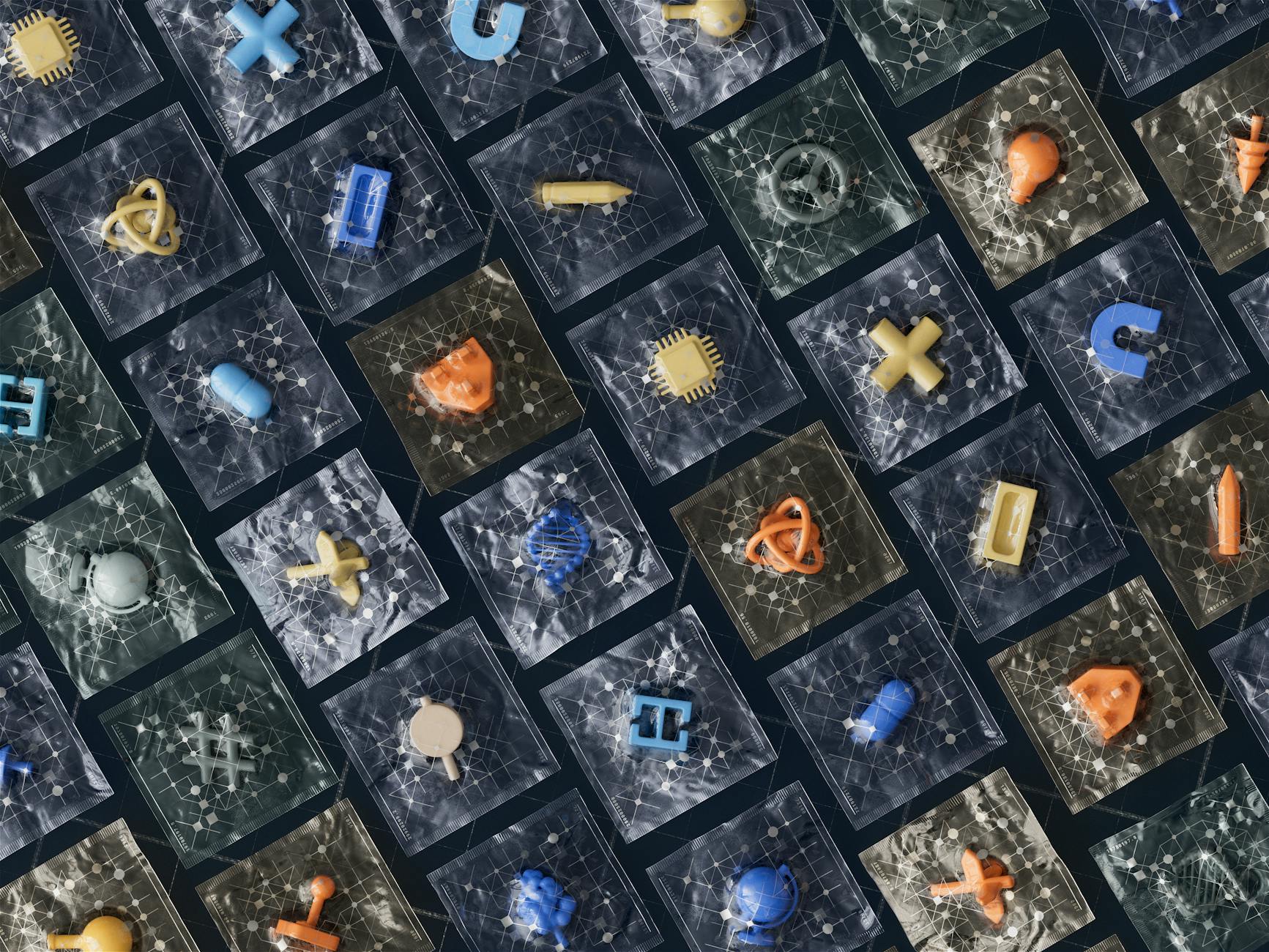
Technology icons are visual representations of digital concepts, actions, or objects that help users navigate and interact with digital products. They're an essential aspect of user experience (UX) design, as they provide a quick and intuitive way to communicate complex ideas and functionality. A well-designed technology icon can make all the difference in enhancing user engagement, reducing cognitive load, and reinforcing a brand's visual identity.For instance, the recycle bin icon, which has become an ubiquitous symbol for deleting files, is a prime example of a technology icon that has become synonymous with digital waste management. Its simplicity and universality have made it an instantly recognizable symbol across different platforms and cultures.
Key Factors in Effective Technology Icon Design
When designing technology icons, there are several key factors to consider. Here are a few essential aspects to keep in mind:The Importance of Scalability
A good technology icon should be scalable, meaning it should remain legible and visually appealing at various sizes and resolutions. This is particularly crucial in today's multi-device world, where icons may be displayed on a range of devices, from smartphones to large monitors.Best Practices for Technology Icon Design
Here are some step-by-step best practices to help you create effective technology icons:- Keep it simple: Avoid clutter and focus on simple, bold shapes that can be easily recognized at small sizes.
- Use a consistent visual language: Establish a consistent visual style across your icons to reinforce your brand's identity and create a cohesive user experience.
- Test for legibility: Ensure your icons are legible at various sizes and resolutions to guarantee a seamless user experience across different devices.
Common Mistakes to Avoid in Technology Icon Design
When designing technology icons, it's easy to fall into common pitfalls that can compromise their effectiveness. Here are a few mistakes to watch out for: Overly complex designs: Avoid intricate details or overly complex shapes that may become illegible at small sizes.
Inconsistent visual language: Failing to establish a consistent visual style across your icons can create a disjointed user experience and dilute your brand's identity.
Frequently Asked Questions
Q: What is the ideal size for a technology icon?The ideal size for a technology icon depends on the platform and device. Generally, icons should be designed to be legible at a minimum size of 16x16 pixels.
Q: How do I choose the right color scheme for my technology icons?
When selecting a color scheme for your technology icons, consider your brand's visual identity and the platform's design guidelines. Stick to a limited color palette to maintain consistency and ensure legibility.
Q: Can I use font-based icons in my digital product?
Font-based icons can be a convenient option, but they may not offer the same level of customization and visual polish as custom-designed icons. Use font-based icons judiciously and consider creating custom icons for critical interactions.
Final Thoughts
Mastering the art of technology icons requires a deep understanding of UX design principles, visual identity, and best practices for implementation. By following the guidelines outlined in this article, you'll be well on your way to creating effective technology icons that enhance user experience and reinforce your brand's visual identity. Take the next step by reviewing your current digital products and identifying opportunities to improve your icon design. As technology continues to evolve, the importance of well-designed technology icons will only continue to grow.

