You're probably familiar with the iconic logos of tech giants like Apple, Google, and Facebook. But have you ever stopped to think about the humble technology icon that appears on your smartphone, computer, or tablet? These tiny visual elements play a huge role in shaping our digital experiences. A well-designed technology icon can make all the difference in user engagement, brand recognition, and overall aesthetic appeal.
What are Technology Icons and Why Matter?
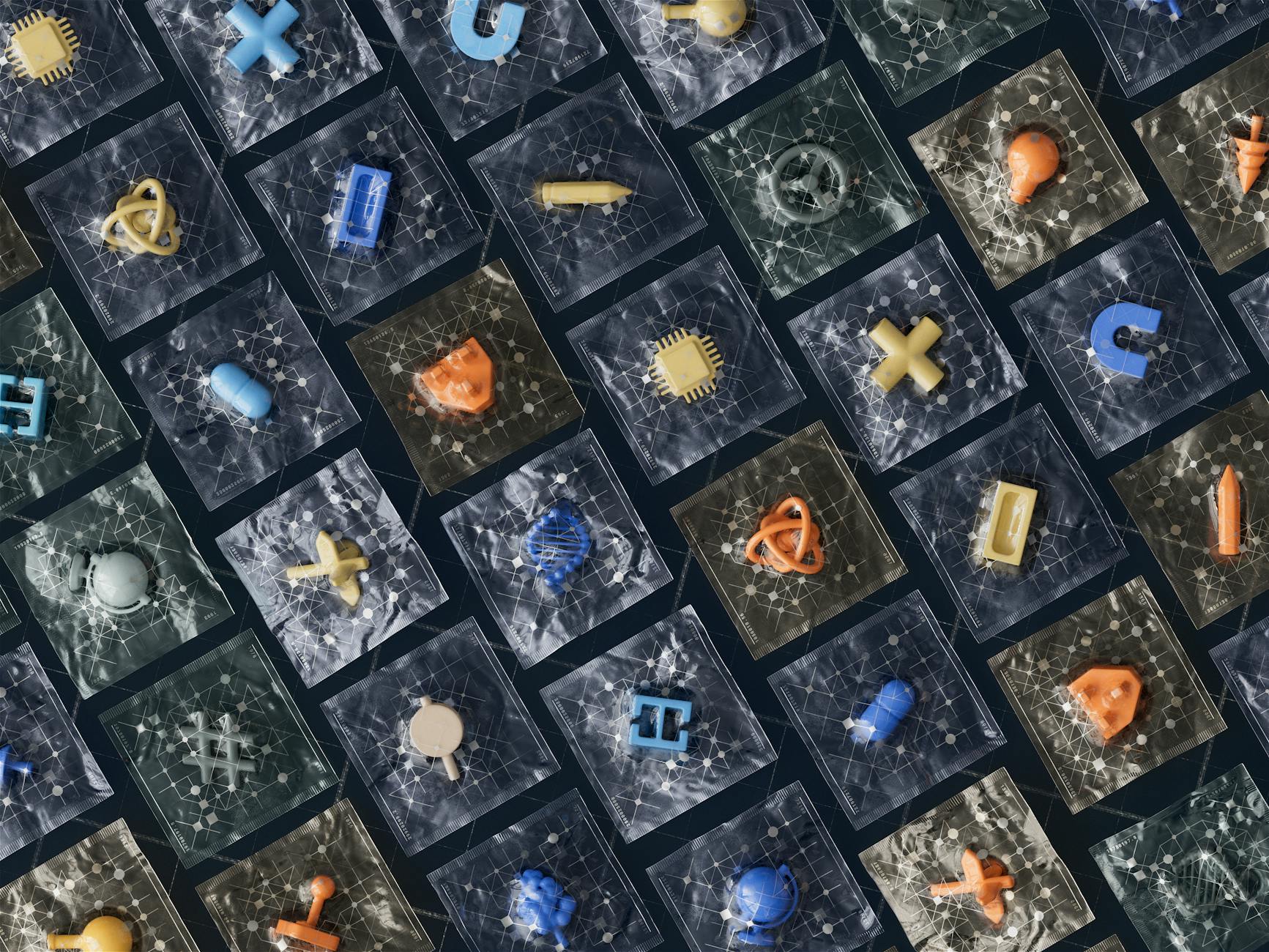
Technology icons are visual representations of digital concepts, objects, or actions. They're used to communicate complex ideas in a simple, intuitive way. A good technology icon should be instantly recognizable, easy to understand, and scalable across various devices and platforms. For instance, the universally recognized icon of a floppy disk, which represents the "save" function, has become an integral part of our digital vocabulary.Key Factors in Effective Technology Icon Design
When designing technology icons, there are several key factors to consider.The Importance of Simple and Consistent Design
A simple design ensures that your icon is easily recognizable, even at small sizes. Consistency in design language helps create a cohesive visual identity across your platform or application. For example, Google's Material Design icons are instantly recognizable due to their consistent use of bold lines, bright colors, and geometric shapes.Best Practices for Creating Technology Icons
Here are some best practices to keep in mind when creating technology icons:- Keep it simple: Avoid clutter and focus on the essential elements of your design. A simple icon is more versatile and easier to recognize.
- Use a consistent design language: Establish a visual style guide to ensure consistency across all your icons.
- Test for scalability: Ensure your icon looks great at various sizes and resolutions.
- Consider accessibility: Design icons that are accessible to users with visual impairments by providing alternative text descriptions.
Common Mistakes to Avoid in Technology Icon Design
When designing technology icons, it's easy to fall into common pitfalls. Over-complicating the design: Avoid adding too much detail or trying to convey too much information. This can make your icon look cluttered and confusing.
Ignoring platform guidelines: Familiarize yourself with platform-specific design guidelines to ensure your icons meet user expectations.
Frequently Asked Questions
Q: What is the ideal size for a technology icon?The ideal size for a technology icon depends on the platform and device. Generally, icons should be designed to be recognizable at a minimum size of 16x16 pixels.
Q: How do I ensure my technology icons are accessible?
Provide alternative text descriptions for your icons, and consider using high-contrast colors to improve visibility.
Q: Can I use technology icons from other sources?
While it's tempting to use pre-made icons, it's essential to ensure you have the necessary permissions or licenses. Consider creating your own custom icons to maintain brand consistency.
Final Thoughts
Mastering the art of technology icon design can elevate your brand and enhance user experience. By following best practices, avoiding common mistakes, and staying up-to-date with platform guidelines, you can create visually stunning icons that resonate with your audience. Take the first step towards visual excellence by auditing your current icon design and experimenting with new design approaches. As technology continues to evolve, the role of technology icons will only become more crucial in shaping our digital interactions.

