You're probably familiar with the likes of Apple's bitten apple, Google's colorful "G," or Facebook's iconic "F" logo. These technology icons have become synonymous with their respective brands, evoking instant recognition and recall. But have you ever stopped to think about what makes these icons tick? What sets them apart from the countless others that clutter our digital landscape?
Understanding the Power of Technology Icons
At their core, technology icons are visual representations of a brand's identity, values, and mission. They're often the first point of contact between a company and its audience, making them a crucial element in establishing brand recognition and credibility. A well-designed technology icon can convey a sense of innovation, trust, and professionalism, while a poorly designed one can have the opposite effect.

Take, for instance, the iconic IBM logo, also known as the "8-bar logo." Designed in 1972, this logo features eight bars of varying lengths that represent the company's name in a unique and memorable way. The logo has undergone several transformations over the years but has retained its essence, becoming an instantly recognizable symbol of the brand.
Key Factors in Designing Effective Technology Icons
So, what makes a technology icon effective? Here are a few key factors to consider:
Simplicity and Scalability
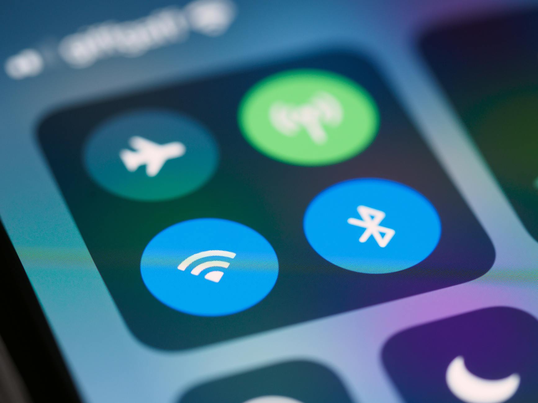
A good technology icon should be simple, yet distinctive. It should be scalable across various platforms and devices, from tiny favicon sizes to massive billboards. You don't want your icon to become pixelated or lose its integrity when viewed at different resolutions.
Color Psychology
Color plays a vital role in icon design. Different colors evoke emotions and convey meanings. For example, blue is often associated with trust and stability, while orange is linked to creativity and playfulness. Choose a color scheme that aligns with your brand's personality and values.

Step-by-Step Guide to Designing Your Own Technology Icon
Ready to create your own iconic technology symbol? Here's a step-by-step guide to get you started:
- Define Your Brand Identity: Before designing your icon, you need to have a clear understanding of your brand's mission, values, and personality. This will help you create an icon that accurately represents your brand.
- Brainstorm and Sketch: Take some time to brainstorm ideas and sketch out rough concepts. Consider using simple shapes, lines, and typography to create a unique and memorable design.
- Refine and Iterate: Refine your design, making sure it's scalable, legible, and visually appealing. Iterate on your design until you're satisfied with the final result.
Best Practices for Technology Icon Design
Here are some additional best practices to keep in mind when designing your technology icon:
- Keep it Simple: Avoid clutter and excessive details. A simple design is often more effective than a complex one.
- Make it Memorable: Use distinctive shapes, colors, or typography to create an icon that sticks in people's minds.
- Ensure Consistency: Use your icon consistently across all platforms and devices to reinforce your brand identity.
Common Mistakes to Avoid
Don't fall into these common traps when designing your technology icon:
- Don't Overcomplicate: Avoid using too many colors, shapes, or details. This can make your icon look cluttered and difficult to recognize.
- Don't Copy Others: Make sure your icon is unique and doesn't resemble existing logos or icons.
- Don't Neglect Scalability: Ensure your icon looks great at various sizes and resolutions.
Frequently Asked Questions
Q: What makes a technology icon iconic?
An iconic technology symbol is often simple, memorable, and scalable. It should be instantly recognizable and evoke a strong emotional response.
Q: How do I choose the right colors for my technology icon?
Select colors that align with your brand's personality and values. Consider the emotions and meanings associated with different colors and choose a scheme that resonates with your audience.
Q: Can I use a font as my technology icon?
While using a font as an icon is possible, it's not always the best approach. Fonts can be difficult to scale and may not be as distinctive as a custom-designed icon.
Q: How do I ensure my technology icon is consistent across all platforms?
Establish clear brand guidelines and ensure that your icon is used consistently across all platforms and devices.
Final Thoughts
Creating an iconic technology symbol requires a deep understanding of design principles, brand identity, and audience psychology. By following these guidelines and best practices, you can create a memorable and effective icon that elevates your brand and resonates with your audience. Take the first step today and start designing an iconic technology symbol that represents your brand's values and mission. As technology continues to evolve, one thing is certain – a well-designed icon will remain a vital component of your brand's visual identity.
