You're probably unaware that a simple icon can significantly influence user behavior and brand perception. A well-designed technology icon can elevate your brand's visual identity and convey complex ideas in an instant. By the end of this article, you'll understand the power of technology icons and how to harness their potential to enhance your digital presence.
What is a Technology Icon?
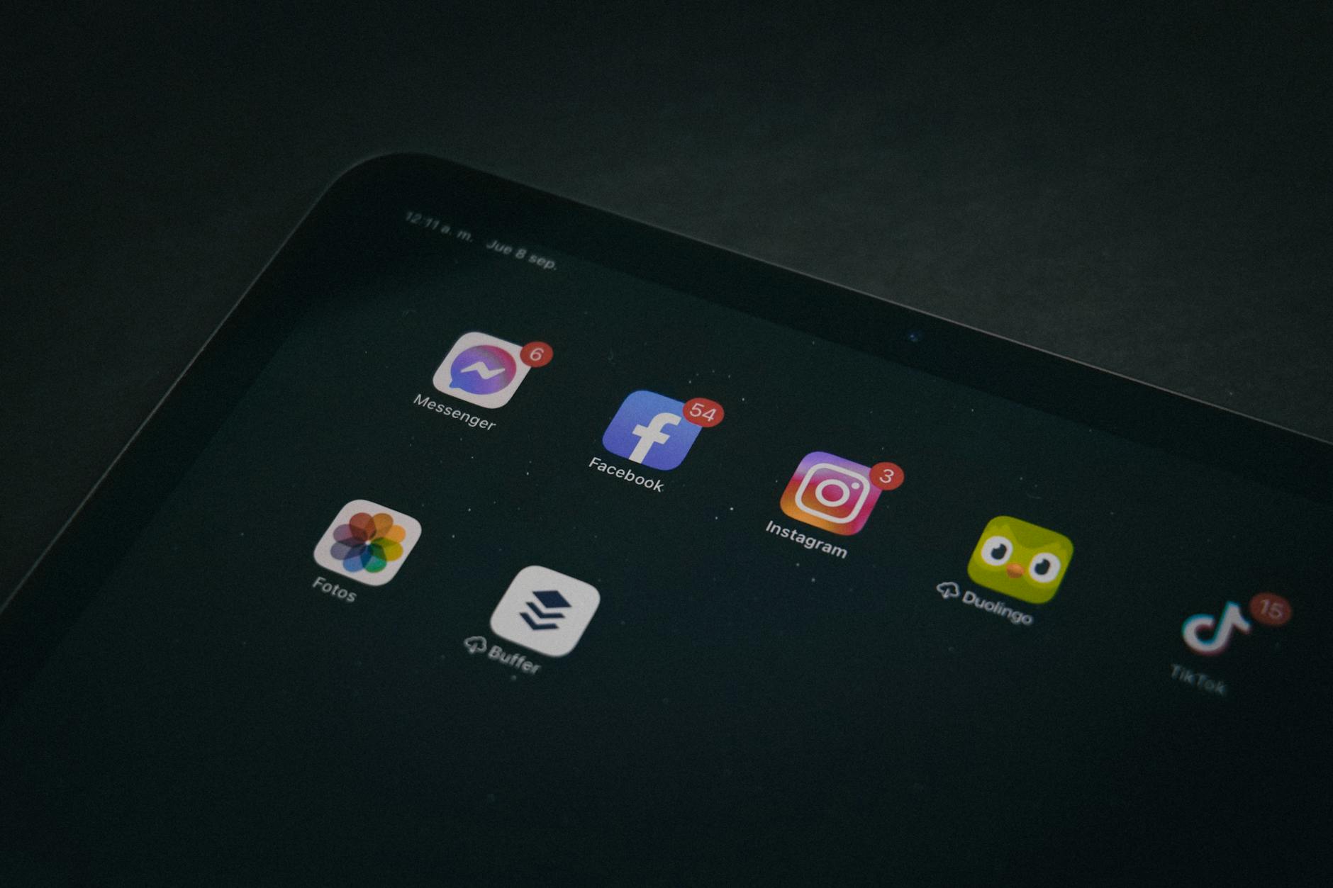
A technology icon is a graphical representation that symbolizes a concept, object, or action related to technology. These icons have become an integral part of our digital landscape, appearing in software, websites, mobile apps, and even marketing materials. For instance, the universally recognized Wi-Fi symbol has become synonymous with wireless internet connectivity.The Psychology Behind Technology Icons
Technology icons tap into our cognitive abilities, allowing us to quickly process and understand complex information. When designed effectively, icons can evoke emotions, convey meaning, and guide user interactions. Consider the recycle bin icon on your computer – it's a simple yet powerful symbol that communicates the action of deleting files.The Power of Color in Icon Design
Color plays a crucial role in icon design, as it can significantly impact user perception. A study by HubSpot found that using the color red in CTAs can increase conversions by 21%. When selecting colors for your technology icons, consider the emotions and associations you want to evoke. For example, blue is often associated with trust and stability, making it a popular choice for tech-related icons.Best Practices for Designing Effective Technology Icons
Here are some key takeaways to keep in mind when designing or selecting technology icons:- Keep it simple: Avoid clutter and ensure your icon is easily recognizable at various sizes and resolutions.
- Be consistent: Establish a visual language and apply it consistently across your digital platforms.
- Use intuitive symbols: Select icons that are universally understood or create custom designs that are easy to comprehend.
- Test and iterate: Gather feedback from users and refine your icons to ensure they meet your goals.
Common Mistakes to Avoid
When working with technology icons, it's essential to avoid common pitfalls that can undermine your design efforts: Using icons that are too complex or difficult to understand
Inconsistent icon design across different platforms
Ignoring accessibility guidelines for icon design
Not testing icons with real users
Frequently Asked Questions
Q: What makes a technology icon effective?An effective technology icon is simple, intuitive, and consistent with your brand's visual identity. It should be easily recognizable and convey the intended meaning.
Q: How do I choose the right color for my technology icon?
Select a color that aligns with your brand's color scheme and evokes the desired emotions. Consider the associations and connotations of different colors to ensure your icon resonates with your target audience.

Q: Can I use free icon resources for my project?
While free icon resources can be tempting, ensure that the icons are licensed for commercial use and align with your brand's visual identity. Custom-designed icons can provide a unique and cohesive look.
Q: How do I ensure my technology icons are accessible?
Follow accessibility guidelines, such as providing alternative text and ensuring sufficient contrast between the icon and background. This will help users with disabilities and improve overall usability.
Final Thoughts
By mastering the art of technology icons, you can elevate your brand's digital presence, enhance user experience, and drive engagement. Take the first step by auditing your current icon design and exploring opportunities to create a cohesive visual language that resonates with your audience. As technology continues to evolve, staying ahead of the curve in icon design will become increasingly important – start designing with intention today.