The symbols that populate our screens, from the humble folder icon to the instantly recognizable logos of social media platforms, are more than just cute graphics – they're the unsung heroes of digital communication. You probably interact with dozens, if not hundreds, of technology icons every day, but have you ever stopped to think about their impact on your user experience? By understanding the power of technology icons, you'll gain a deeper appreciation for the role they play in shaping our digital world.
What Are Technology Icons and Why Matter?
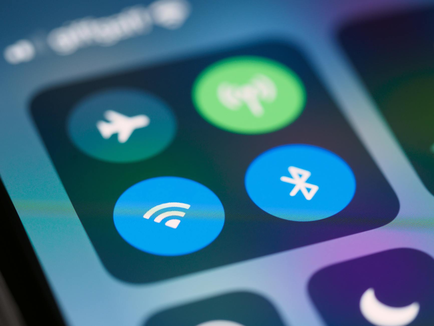
Technology icons are visual representations of concepts, actions, or objects that help users navigate digital interfaces. They're an essential part of user experience (UX) design, as they facilitate quick comprehension and interaction with digital products. A well-designed icon can convey complex information in a fraction of a second, making it an indispensable tool for designers and developers. For example, the universally recognized "recycling" symbol, comprising three chasing arrows, has become synonymous with eco-friendliness and waste management.Key Factors in Effective Icon Design
Effective icon design hinges on several key factors, including simplicity, consistency, and intuitiveness.The Importance of Simple, Recognizable Shapes
When it comes to icon design, less is often more. Simple shapes and bold lines help icons remain recognizable at various sizes and resolutions. Consider the logo of a popular social media platform like Facebook; its iconic "F" symbol is instantly recognizable, even when displayed in a small size.Best Practices for Using Technology Icons
To get the most out of technology icons in your digital projects, follow these best practices:- Use established conventions: Stick to widely recognized symbols for common actions, like a trash can for deletion or a printer for printing.
- Be consistent: Ensure icons are used uniformly throughout your interface, with similar icons representing similar actions.
- Test for clarity: Validate your icons with users to ensure they're easily understood.
- Optimize for accessibility: Ensure icons are legible for users with visual impairments by providing alternative text.
Common Mistakes to Avoid in Icon Design
While technology icons can be incredibly effective, there are several common pitfalls to watch out for: Overly complex designs: Avoid intricate details that may become lost at smaller sizes.
Inconsistent usage: Refrain from using the same icon to represent different actions or concepts.
- Poor color choices: Select colors that provide sufficient contrast with the background and are accessible to color-blind users.
Frequently Asked Questions
Q: What makes a technology icon effective?
An effective technology icon is simple, intuitive, and consistent with established design conventions. It should convey its meaning quickly and accurately.

Q: How do I design an icon for my app or website?
Start by researching existing icons and identifying common design elements. Keep your design simple, and test it with users to ensure it's clear and understandable.
Q: Can I use any icon I find online in my project?
No, it's essential to use icons that are licensed for commercial use or have explicit permission from the creator. You can also create your own icons or use icon sets from reputable sources.
Q: How do I ensure my icons are accessible?
Provide alternative text for icons, and ensure they meet contrast and color accessibility standards.
Final Thoughts
As you've seen, technology icons play a vital role in shaping our digital experiences. By understanding their importance and following best practices for design and use, you'll be able to harness their power to communicate more effectively with your users. Now that you've gained a deeper appreciation for technology icons, take a closer look at the icons that surround you – and consider creating your own iconic symbols that will leave a lasting impact on your audience.